

►

Design Your Ride. See It Come Alive.
►
►
►
To understand real in-store needs, my team and I visited a Vans retail location and interviewed an employee about customer behavior and customization habits. We learned that the Vans’ skate section feels indistinguishable from other stores, many customers want help building custom boards, and there is a clear opportunity to offer a more tailored, interactive skate experience.
Research and Discovery
Vans’ retail space does not have any differentiators from other skate stores in terms of their skateboards

Decent amount of customers looking to make custom boards, all staff know how to build boards
Customers need a tailored experience, more customization options, and a better skate experience
INDISTINGUISHABLE

VARIETY OF PEOPLE
OPPORTUNITIES
Based on our findings, we began creating low-fidelity wireframes for the in-store experience shown in Figure 1. We then refined these into mid-fidelity wireframes in Figure 2, adding key functions and clarifying navigation to improve usability.
Ideation and Wireframing
Figure 1 (Low-Fidelity)
High-Fidelity Wireframes
Figure 2 (Mid-Fidelity)


UI Design and Branding
In the high-fidelity design, we focused on creating a seamless navigation experience. Color was used to highlight clickable elements, a clean sans-serif typeface improved legibility, intuitive icons supported quick recognition, and a consistent bottom navigation bar ensured users always knew where they were within the app.
Orange is used for emphasis and call-to-action buttons. It creates a strong visual hierarchy and draws users to interactive elements.
Typography supports brand tone by being approachable, modern, and functional, while keeping historical content easy to digest.


NAVIGATION

Prototyping and Testing
To ensure users had the best experience with the app, we conducted usability testing with ten participants. We asked them to complete tasks and share feedback on their overall experience, pain points, and any areas of confusion. This process helped us identify what worked well and where improvements were needed, guiding refinements to navigation and clarity.
BUTTONS
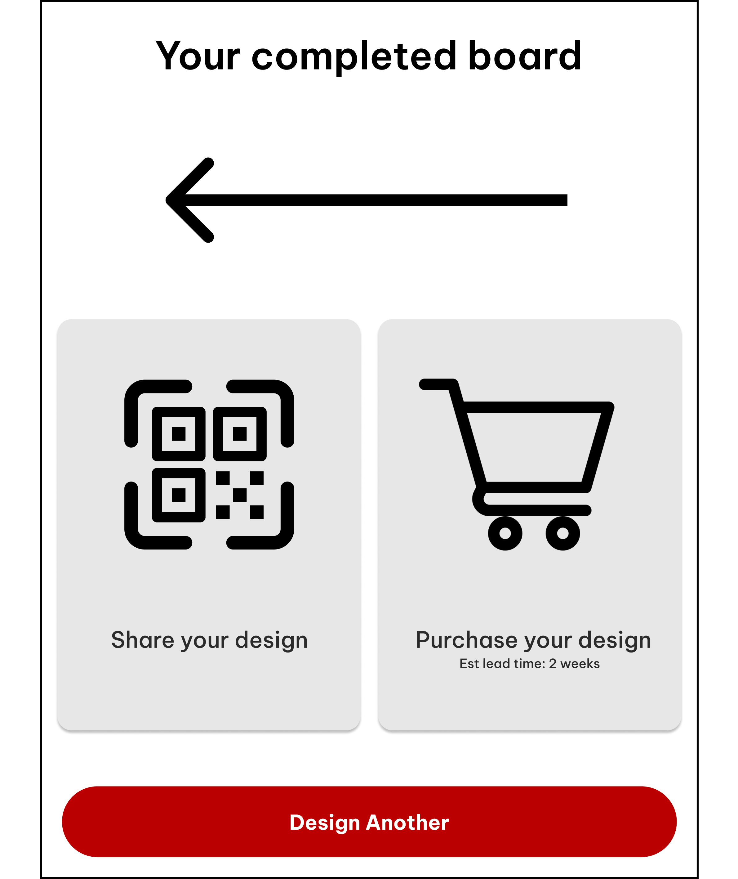
Check out my Prototype!
Click Expand to Start!!
90% completed the main navigation task on their first attempt

30% suggested stronger visual cues for clickable elements.
RESULTS
Improve navigation between pages
Intuitive button layout/larger pictures
Recommendations & Categories
Conclusion and Key Takeaways
This project highlighted the value of user testing in refining navigation, clarity, and accessibility. Small design adjustments made a significant impact, reinforcing the importance of an iterative, user-centered approach.
Include more Prominent Pictures
Find the Root Cause of Confusion
An Intuitive and Consistent Button Layout